
Now that we’ve seen Apple’s new flagship device, and have the simulator to boot (🥁!), I’ve been diving in on adapting Elite Hoops for the new form factor. As Cupertino & Friends™️ note in their tech talks, we’ve been here before. Over its ~20-year life, we’ve seen the iPhone grow taller, become shorter, lose a home button, gain some ears, and then some. Those of us who’ve been around likely already have developed a precocious ability to listen to Apple to handle these changes, and use Auto Layout/safe area/etc. etc. etc.
And so, after playing around with the device and coming up with a design plan, there’s one word I keep returning to: expressivity. This device allows you to express what you already offer in new and, in many cases, better ways. Much like when adapting an app for iPad, you don’t gate features by device, you let them grow and mature with the form factor.
Here’s a preview of what I’ve done. But first, you need to set your codebase up a little. Let’s start with a few things that may screw you if you’ve put these types of things off:
- Using device idiom checks.
- Relying on
UIScreen.main— it’s going to be deprecated soon. - Not supporting landscape orientation.
- Using
.leading/.trailingtoolbar placements for close buttons. UseToolbarItem(placement: .cancellationAction). - Not relying on size classes.
All of those will torch you here, but luckily, there’s a built-in skill to help with all of this: app-resizability. It’ll help you address all of those.

Now, let’s get to the design changes, pose by pose:
Closed
The closed pose will be easiest for most of us. It’s basically a chonky iPhone:
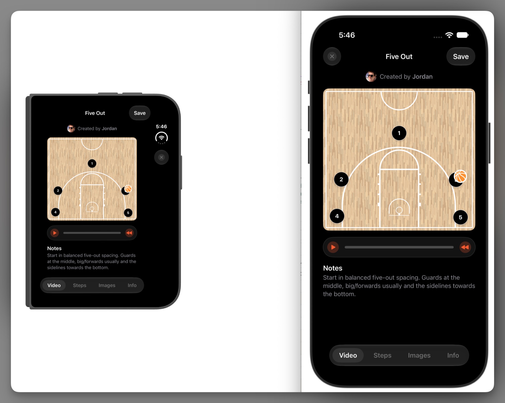
Here, you’re mainly looking at bars: navigation bars, tab bars, toolbars — that kind of thing. That’s because of the nascent vertical bar setup, and the fact that the system will sometimes need to overflow items. The question you need to ask is: what’s most important, is there anything that should always show, and what can be over…flown (is that a word?).
Things that need to stick around? Use the .topBarPinnedTrailing placement. Do you want it to win out over other things when an overflow is needed? Reach for .visibilityPriority(.high). Or, overflow ahead of time with ToolbarOverflowMenu.
Opened
This is where the fun starts, and we get an opportunity to express existing features differently. Here, someone is viewing a public play. But — I’ve got more room to play with! So, let’s make use of it:
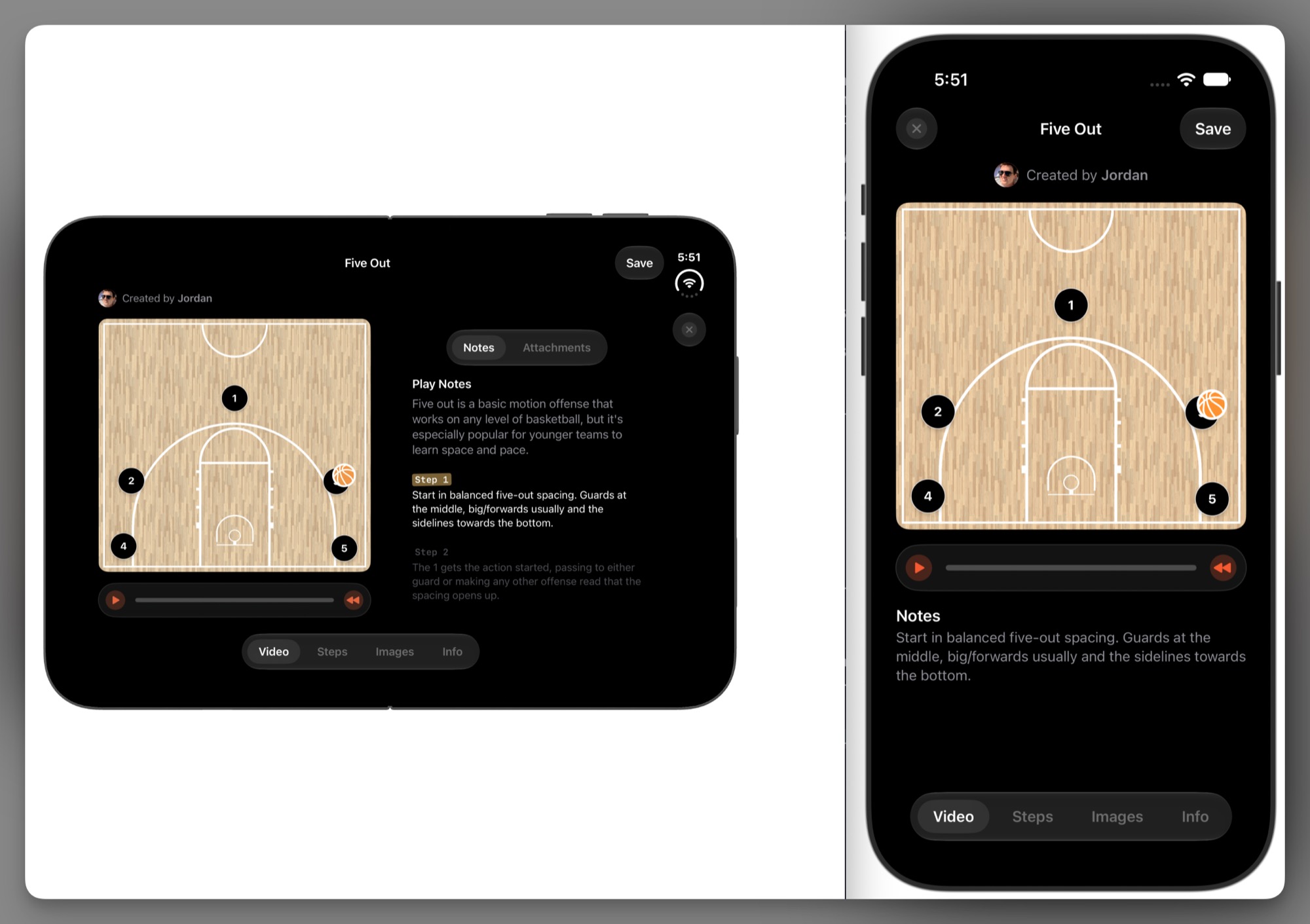
Using the new ArrangementView, along with @Environment(\.toolbarVerticalEdge), there’s an opportunity for more data density. And, that’s what you’re seeing here: let’s show the play notes or its attachments — stuff that supports the primary view. But now, there’s more room for it.
I think this is where the bulk of your work comes for iPhone Duo. Don’t simply aim for making your app work on it, make it freakin’ baller! And, I think this is one way you can do it. Another example:
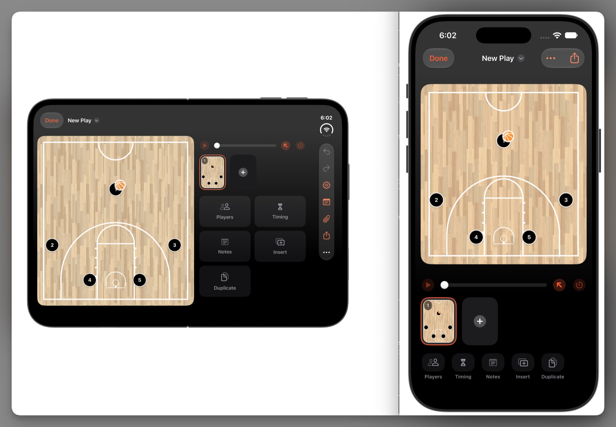
The play designer in Elite Hoops is where the bulk of coaches spend their time. It has several tools, but needs to keep the focus on the court, and where players should be. With Duo, I’m able to make two critical improvements: space out those tools in the toolbox, and make them bigger.
Continuing the theme of data density, and the ability to spread it out — let’s look at the changes for when a coach is running practice:
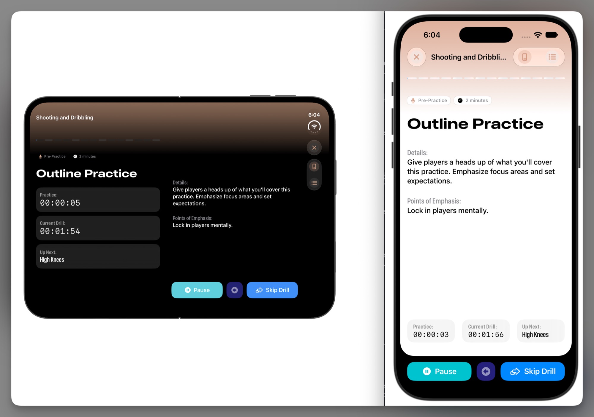
Here, I’m able to make the important things stand out a little more. How much time is left in this drill? What’s next? What are the drill’s steps? It’s all made a bit easier to parse on Duo.
The part that I am currently undecided on, however, is how liberally to deploy these arrangement view refactors. Do I always leave them in, and let iOS decide? That’s one part I’ve not yet worked out.
Rotated
For rotations, I’ve found that my existing size-class-based decisions (in terms of how to present things) held up remarkably well. For example, for the digital whiteboard, it now takes advantage of Duo’s real estate to expand and have a richer area for coaches to mark up with their Apple Pencils:
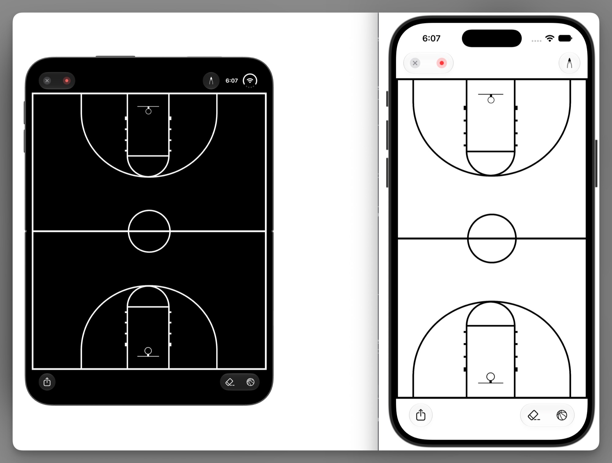
Not much to say here, I’ve found that it essentially mirrors what your iPad implementation does today. As it should.
Folded
For folded situations, there wasn’t much to address. It leverages the arrangement view in most cases, and in some cases, it doesn’t, on purpose. I’m in love with how it looks, though. For example, here’s the play designer from earlier:
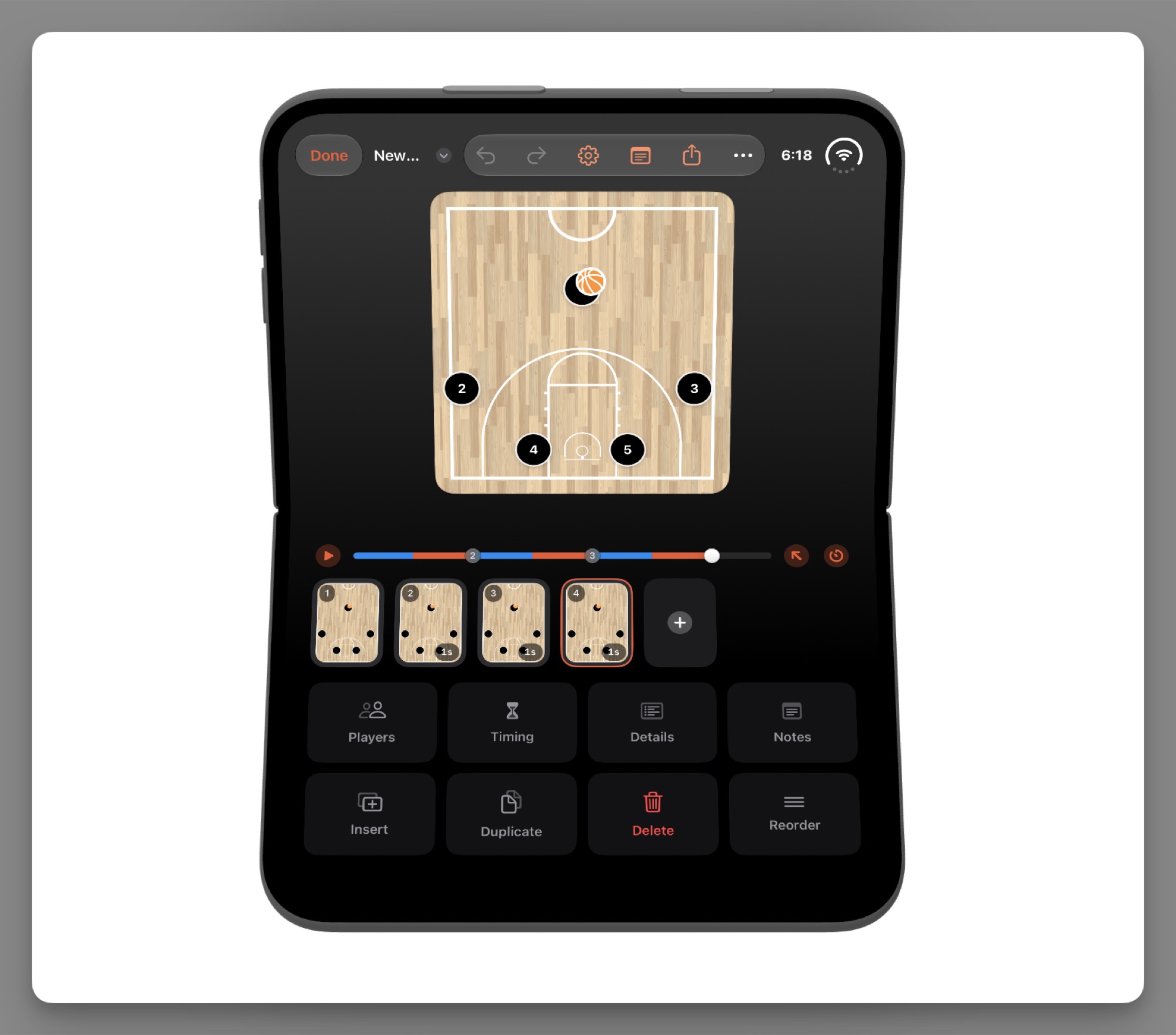
One thing I want to emphasize is that the system does the right thing nearly every time, as long as you didn’t reinvent the wheel. Things like the new reserved area and staying away from the fold in these folded situations — the system does all the work. Let it.
Revisiting old assumptions
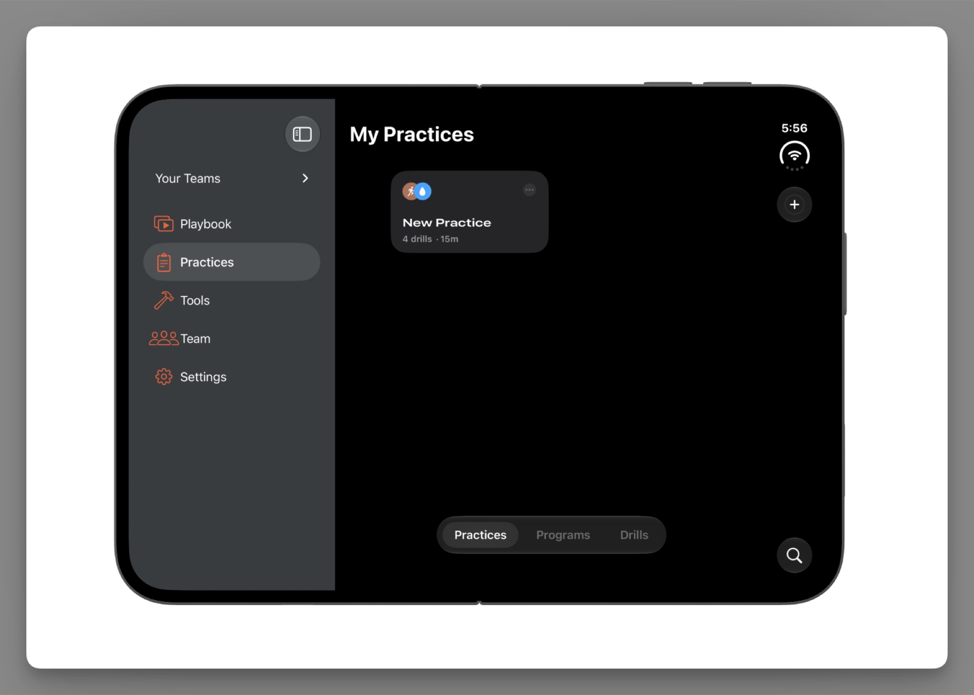
Designing for iPhone Duo already pushed me to make some navigational improvements for Elite Hoops that I’ve wanted since launch: using a split view. I’ve put this off more times than I can count, but it fit in with all of the other work I was already doing:
Plus, I had to revisit UI that looked great on modern iPhones but was no longer at home on Duo. For example, these bottom rounded corners look quite nice and are concentric with iPhones, but they look out of place on Duo in my opinion:
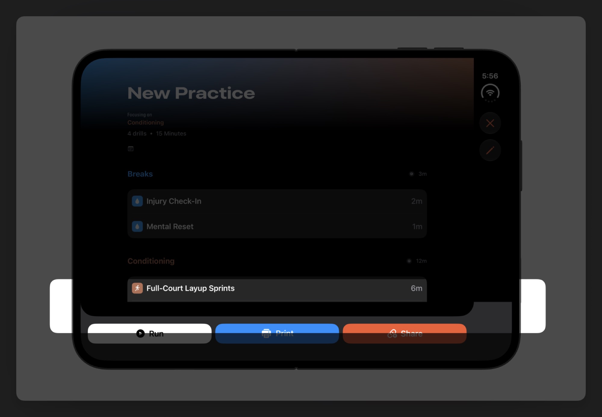
You’ll quickly find places where you should’ve used a Label with an image and title. I cleaned up all such instances so that they show correctly in overflow menus with a more descriptive string supporting what the action will do.
Final thoughts
And that’s a wrap. If there’s one thing the iPhone Duo has been for me, it’s fun. I have to get one of these! It’s a business expense, after all. Sometimes there’s a serendipitous moment where what you want and what you need end up being the same thing, I guess. The Duo is an exciting little device to design for, and it’s not every day we get new form factors to bring about some fresh new ideas or new angles.
Until next time ✌️