Ah yes, the feature.
A core tenet of both software development and startup life, their existence commands as much mental processing as it does actual coding and manpower. While we each claim to follow our own heuristics that lead us to the ever moving target of being “feature complete”, I’ve come to appreciate the process and I thought I’d document what it looks like for me from a recent example.
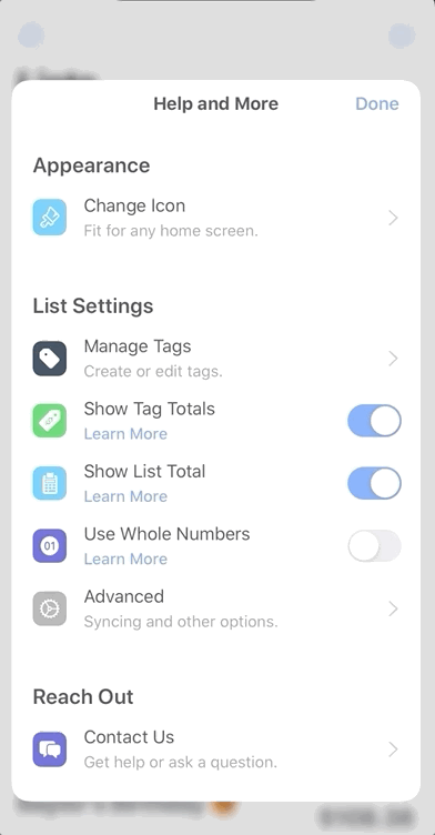
The feature in question for Spend Stack? The tent pole “nice to have”, and incredibly fun, feature in any iOS app: custom icons.
What follows is a mental scribble of how the process takes place for me.
The Validation
The first lesson I’ve learned in terms of product development is this: Ask some validation questions early and often.
Do you really need to do this? Does it help you achieve a better product, higher quality app or a more entertaining game?
And custom icons is a great example. Why? Because a gillion great, high quality apps exist that don’t leverage the feature at all. But, what custom icons does bring to the table, it brings very well. It’s something that many apps overlook or are simply ignorant to - and that is the simple act of bringing about joy in our software.
That’s right, it’s about to get all Marie Kondo up in here.
But unlike the undisputed organizational people’s champ, here we bring joy by simply being fun. And no matter what your app’s voice is (another blog post in of itself), it can pay to tactfully elicit joy. And that mental thread is what gave me the “go ahead” to spend time creating such a feature.
So, we validated the thing we want to add. What’s next?
The…Design?
Arguably the most challenging part of the entire process isn’t writing the code or arguing your stance to make the thing, it’s without question designing said thing. Here is where most of us find ourselves getting lost, losing motivation or simply berating our own work to the point of leaving it behind altogether.
Put simply, we start with a pile of junk. Let’s call it like it is, our first drafts usually suck. I know that’s true for me, and probably for most of you reading this. As I mentioned in another post:
…The common indie dev learned all about retain cycles and pointers instead of color theory and typography…
Put simply, design isn’t natural for a lot of us. So, here’s what I’ve come to do:
- Find Apple’s, or other apps you respect, who’ve made what you’re trying to make.
- Write down why you enjoy the example you’ve found.
- If there is no example, question if you’re really making something that’s needed.
- 3a: If you are - great! You’re charting new territory, perhaps you’re onto a new innovation in your field and you’ll be the first.
- 3b: Plus, even if your design totally bombs, it’ll be the only design that exists - so at the same time it will also be the best- win, win!
- Sketch things out in a way you can move quickly using notes from step 2.
- Iterate, but don’t dwell.
This list is fairly easy to grok, but I’ll say a few words about points four and five.
Sketching Things Out
I’ve found a ton of value in just getting some ideas out quickly. Sketch or Figma are usually what seasoned designers crack open, and that makes sense for them. It’s their wheelhouse, their Xcode. But for me, I still stumble around in those apps for a bit until I get where I need to be.
So, to that end - I just simply draw. And, half the time, I never even open a high fidelity program to map things out more. Heck, I usually turn to SwiftUI before I do that (both a massive compliment and damning condemnation since I don’t end up shipping with that work). These days, I’m using a wonderful to-the-point infinite canvas app, aptly named Scratch Paper to do the job:
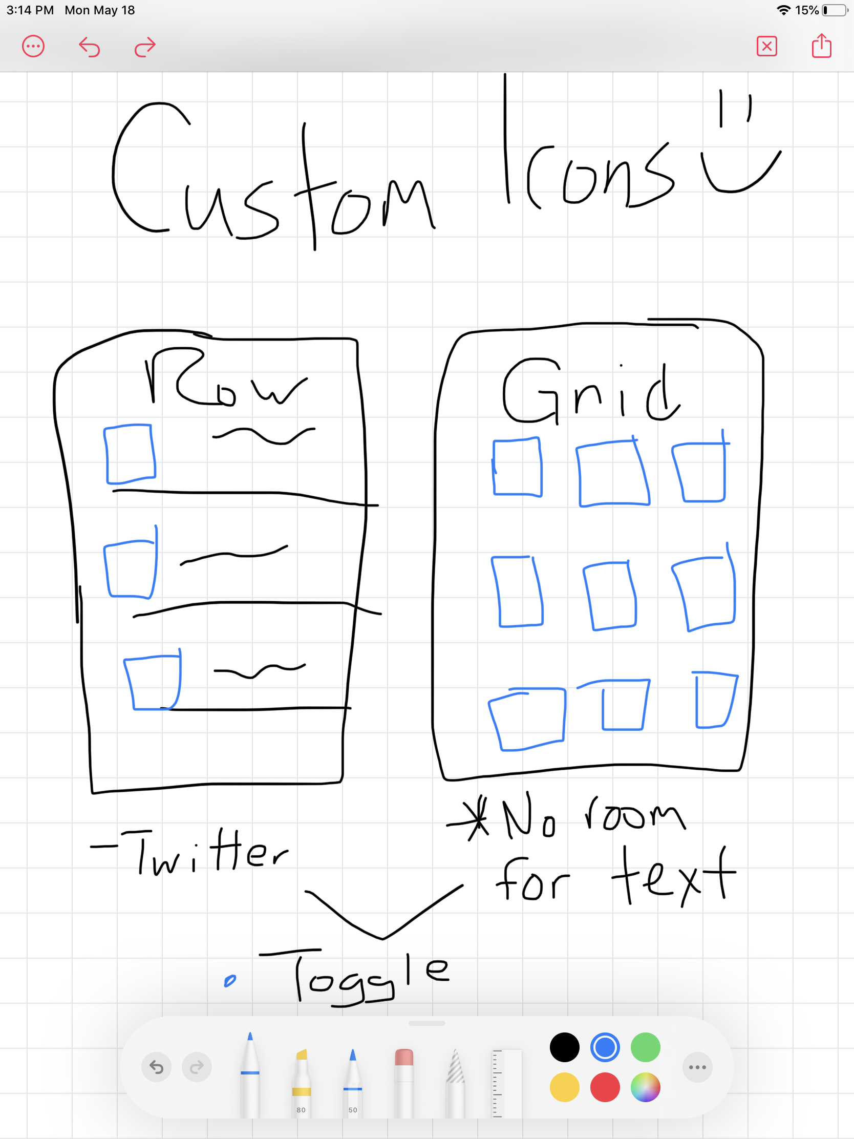
Yes, my drawings truly are that terrible. But what they do is help me discover problems early. And here, that dreadful display of my artistic capabilities uncovered the following truths:
- Room for text would be tricky in a grid UI.
- A grid does allow for more display density, but at a cost.
- If lines of text didn’t line up column per column, the varying heights would bother me. A list of row won’t really have this quirk.
Iterating versus Dwelling
Maybe it’s just me, but if I stick on a feature too long I begin to convince myself it’s straight trash. This is doubly true if you’ve already shipped, because as the features mount you’re forced to stretch not only your design muscles, but your UX thought process as well. Tough stuff.
So it is, at this point I try not to overthink it. I tend to make it as “dumb” and as simple as it could possibly be. For me, this typically looks like:
- Removing some gratuitous animations.
- Taking a flow from three taps to one or two.
- Or, even adding taps if the current flow requires too much preconceived “know how” bias I might’ve baked in. For example, other devs on Twitter would know to double tap here, or long press there - but my mom wouldn’t. So, maybe one extra tap and a label explaining what an element does is worth it.
It pays to remember that at this point, the entire planet pretty much uses an iPhone. Your barber, your doctor, your old college professor, your grandparents - it’s much more than just “us”. So, if your flow is new or people have a chance of getting lost - dial it back. No need to put hot sauce on a jalapeno.
A good design connotes simplicity - nearly 100% of the time. Over the years I’ve come up with a complex flow chart to help remind me of this:
Creating the Base MVP
This is one of my favorite parts, because for me - I just feel like I can freakin’ build anything, you know? And I bet you can too! Most of the indie developers I interact with (as I alluded to above) are programmers by trade. So, once we’ve done the part that comes least naturally to us, it’s time to do the part that comes most naturally to us: the coding!
let concatenatedThoughts = """
Reading this post back, I could see how this ordering might seem counterintuitive. You need to know a set of requirements before you can design anything. So, here I'm assuming you've done that - this section speaks to defining a "shippable MVP" that you're ready to develop. A set of requirements has to be laid down already before you'd even know what to design.
"""
Before we do, though - let’s lay down what an MVP for this looks like. This is a permutation of the feature that maybe doesn’t have all that you wanted or envisioned, but it could ship if it had to1.
For this feature, my MVP looked like this:
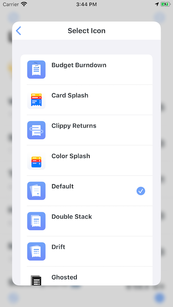
The MVP
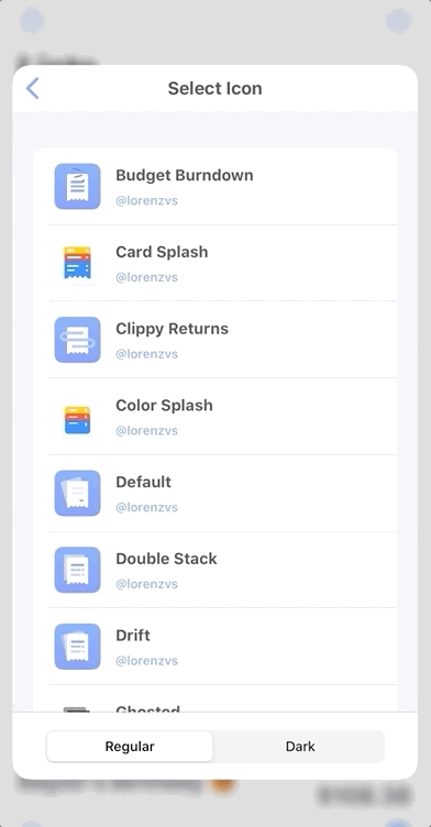
- Assets for, well - new icons.
- A new view to display icons.
- A reconfigured settings view to make room for this new option, and a table row to take users there.
And if I shipped with those things, it still would’ve been a success for me and probably would have looked like this:
Ah, but lest we stop there.
The Sauce
At this point, I could’ve shipped if I had to. But I had more time.
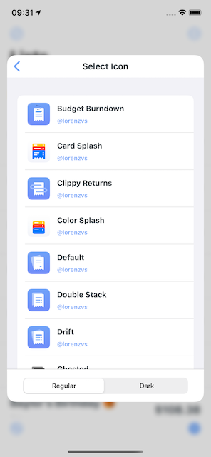
As such, now we get to some of the good stuff. What makes your app stand out? I try to ask myself that critically all the time, and it’s no different even for something like custom icons. To that end, here’s what I wanted to really make the experience great:
- A toggle for dark and light icons.
- An “HD” preview of the icons, with a custom controller transition.
- A link to the designer’s Twitter account.
As you can see, when you mix this with the MVP it’s clear that all of these things are what are commonly referred to as “nice to haves”. But, these are also little bits that users will notice and likely help foster goodwill among your community.
If you’ve used the Spend Stack beta, there’s not much to say here because it shipped with these features mentioned above:
The Best in Class Additions
Lastly, we have to give a feature the fit and finish it truly deserves. This is very different from “the sauce” above. The sauce (by the way, I feel so weird typing “the sauce” over and over but I’ll solider on) is what makes your app stand out, be fun or have competitive advantages.
On the other hand, Best in Class Additions are what make an app feel great, show what the platform can be or what software on it should feel like. These are things I believe every app should be doing, or at least aspire to be like.
For custom icons, here was my list:
- Don’t use
reloadDataon the icon table view, batch reload it. - Use a slide out animation for the notice table row, but a fade animation for batch reloads (the slides were much too busy looking).
- iPadOS Cursor Support.
- Full accessibility and voice over support.
For a quick example of the kind of impacts these things have, consider dismissing this little “hint” using a full reload:
Versus a smooth batching animation:

And, here’s showing an icon with a standard presentation flow which feels a little off:

And, here’s with the custom transition. You can’t really tell due to the .gif quality, but the icon’s corner radius also animates to its original value alongside the interactive drag dismiss:
These are the things that add up over time, and make your app feel “iOS-y”
Also, here are the things I consider best in class but I wasn’t able to get in:
- Full keyboard support (I’m currently rewriting all of this logic, so it made sense to wait).
- Some fun drag and drop options (i.e. drag an icon as an
UIImagepayload).
At this point, custom icons was finished and ready to be tested on the beta. The response was great, and I was happy to get it out. To recap, when I make a feature I tend to follow this flow:
- Validate I should actually make the feature.
- Get a list of what the feature is, roughly sketch it out.
- From that list and sketch, define a “shippable MVP”.
- Time permitting - add in sprinkles of awesome.
- Put in “Best in Class” additions.
- Ship it and be proud of yourself.
- Learn from user feedback, tweak it continually.
On, and don’t forget step 8 - it’s always a good thing to tell others about your work!
Went overboard with adding icons to @SpendStackApp 😎
— Jordan Morgan (@JordanMorgan10) May 13, 2020
🌓Toggle between dark or regular icons
🎨Check out the talented designers on Twitter
📸 These icons have some stellar details - so tap on one to view it in HD
Rolling out ~today ~on the beta 👉 https://t.co/3CZBLXiE5S pic.twitter.com/xcUQeRW5LO
Final Thoughts
And that’s how it happens! When creating a feature for your own app, try to find the flows that help you do the most important thing: ship. There’s a middle ground between everything I’ve listed here and where the reality of actually shipping things lies.
For example, I want to ship every single feature with my ideal flow as I was able to this time: get the MVP done, add in “the sauce” and make sure you’ve considered any best in class additions. But it doesn’t always work that way, and what doesn’t ship today can always ship tomorrow. Thus, my unofficial tour of how Spend Stack becomes the proud parent of a new feature concludes!
Until next time ✌️.
-
For Spend Stack, this was Siri Shortcuts. It hurt not to launch with them, it hurts more they still aren’t there. But these are the choices we have to make as indies (for the record, hell or high water, shortcuts are coming). ↩