It’s always the small things, isn’t it? That’s what makes software great to me. Personal little touches. Lately, I’ve been trying to codify these little moments which make apps just a little nicer. What are they, really? I wrote quite a bit about this very concept in my book series, but I wanted to dig in further.
I think I’ve landed on this definition: They aren’t necessary, but they are welcome.
Exhibit A
Recently, while working on Win the Week, I needed a vanilla permissions view to grant access to health data. While it’s only me using this app, I still wanted to make it look as if someone else could be using it someday:
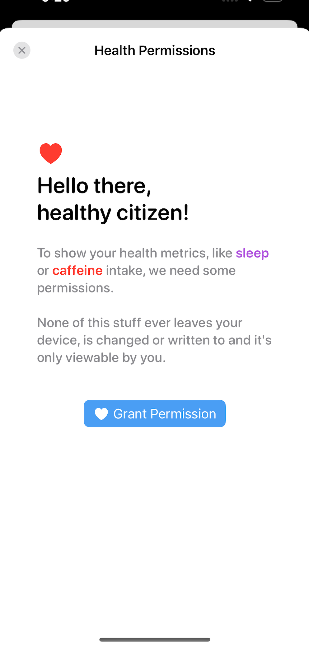
I think that’s good, and I like it. A little cheeky copy, some contrast-y colors, rounded fonts to promote the vibe - it’s working for me. And, to make it just a little nicer, I decided to throw some pop into it using Pow:
Certainly not necessary, but perhaps when you first see it - it’s a welcome, fun little interaction. Situations like this are ripe for making them a little bit nicer because people won’t come across them much. If people would see this permissions screen, say, every time they opened the app - then it would be incredibly annoying.
So, the trick is also being able to discern when to make things just a little it nicer.
Some Other Examples
Let’s visit one of the all time greats, the Apple Design Award winner Things 3. When you resize the window on macOS and hit the mimnimum size, you get a nice little bounce:
Of course, Things 3 could just as well go to the minimum size and stay put when I released the mouse pointer after I was done resizing. No problem there. But, this is just a little bit nicer. And people like nice things.
Going back to my own work, I loved the little springy animations in Spend Stack’s onboarding:
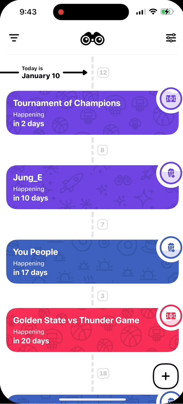
Or, if you simply want a cheat code to seeing several nice little touches, just download Up Ahead. It’s full of them. Notice the little bobble at the top when touching the binocular guy at the top in the navigation bar:
Accessibility
You may have noticed that several of these little tiny touches involved animations, transparency, blurring and scaling. In many cases, folks would want to forgo these things due to accessibility reasons, so take care to query these types of settings during implementation:
// SwiftUI
struct SplashView: View {
  @Environment(\.accessibilityReduceMotion) var axMotion

  var body: some View {
    VStack {
      // UI
    }
    .onAppear {
    	if !axMotion {
    		// Do animation
    	}
    }
  }
}

// UIKit
if !UIAccessibility.isReduceMotionEnabled {
	// Do animation
}
Both SwiftUI and UIKit have extensive support to query these types of values. Don’t miss them!
Update What else is new? Ian Keen shared with me a slick modifier to automatically disable animations according to accessibility settings:
extension View {
    public func accessibleAnimations() -> some View {
        modifier(AccessibleAnimationModifier())
    }
}

private struct AccessibleAnimationModifier: ViewModifier {
    @Environment(\.accessibilityReduceMotion) private var reducedMotion

    func body(content: Content) -> some View {
        content.transaction { if reducedMotion { $0.animation = nil } }
    }
}

// In use...
struct SplashView: View {
  var body: some View {
    VStack {
      // UI
    }
    .accessibleAnimations()
}
Final Thoughts
Making things just a little nicer is one of my favorite phases of app development. I rarely think about it during design, but rather - I find it along the way, if that makes sense? I love coming across these things in other apps, it really adds a element of fit and finish. It’s rare to find these things done well, and they are moreso a shibboleth that only skilled designers or developers know that unlocks membership to nice, quality iOS apps.
Of course, all the usual rules apply. Don’t overdo it, respect accessibility - you know the drill. We are usually great about following those rules, but at the same time, don’t sleep on making your apps fun and just a little nicer.
Until next time ✌️